


 One of the wonderful things about writing Willow Decor is the opportunity to get to know Architects, builders and other designers. Like any master skill, if you look closely and listen to these talented individuals you can learn an amazing amount. Master architect, Tom Catalano of Catalano Architects, was kind enough to send some photos of a house he recently finished. While the house clearly exceeds the price range most of us can afford, reflecting more closely on the design, we can learn a great deal about how to add details and features into our own more modest homes, for a stunning effect.
  Here is the exterior of the home. Of course it is beautiful, but interesting things to note are the the roof lines and the use of multiple materials. Stone, cedar siding and wood accents and doors are featured prominently.
  Additionally notice the curved roof lines, copper roofing and copper accents. The cobblestone driveway also adds to the wonderful feeling outside.
 In your own home try to assess if you can add any one of these features to your existing exterior. A new wood door or cobblestone edging along your driveway or walkway can instantly elevate your exterior.
Of course some things are difficult and expensive to change once in your home- like banisters. But take a look at this entry. The iron spindles add a such a lovely accent to space. Also notice all the mouldings in this area. They are so beautiful. The addition of moldings is another way to add grandness to your spaces. 
The gorgeous living room has all the architectural features to make it a showplace: limestone fireplace, curved large windows, beautiful mouldings. Here the mouldings have been painted a soft seafoam, rather than white and become more prominent in the room. Paint is great tool to use to call more attention to a wonderful feature in your room - who could forget the black painted mantel from the movie It's Complicated (photo link here)?

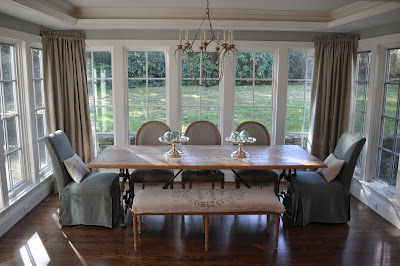
The dining room color echos the living room colors and provides a beautiful flow. Also notice the light fixtures. I love sconces in a dining room. They provide ambient light that can really help create a spectacular atmosphere. Also notice how the beautiful windows are not covered with heavy draperies, but allow the light to flood the room.
 Thea kitchen is an area where details abound: the ceilings are coffered, the cabinets have all the extras, not even the tile was overlooked.
 Notice the detailed inlay on the cabinet crown moulding and the extended sides of the cabinets. Also of note it is the wood wall moulding which highlights the arched opening into the breakfast/dining area.
  I imagine that wall moulding was used to off set this moulding detail entering the family room. The wood trim around the stove hood is interesting.
 Here is a close up of the tile design. Although the center piece is most likely expensive, the tiles that are not embellished are generally more affordable. Adding decorative tiles in strategic places, can give you an expensive, beautiful look for a reasonable cost. This can be done in your current tiled space, by carefully removing specific tiles and replacing the opened area with something more dramatic.
 Another doorway with wall moulding that looks into the breakfast/dining area. I really love the raised fireplace. So cozy in the winter. Notice the color of the kitchen ties in nicely with the color of brick.
 Off the entry, which you can see through the doorway is the library. Who wouldn't love to be surrounded by such fabulous wood and furnishings? Notice the ceiling - a deeper russet than the kitchen. Painting a ceiling in this tone really envelopes you in the room. (Have you noticed I am really into painted ceilings lately?)
 Wonderful marble bath with wall mounted faucet.
 This house has it all, including a to-die-for mudroom. The beadboard walls are so inviting. I love the branch like pulls. Also notice the floor; the slate is set on the diagonal which will make the space seem larger, and then edged horizontally, interesting details!
 Here a back stairway brings you to the second floor. I suspect it is off the mudroom due to beadboard walls. I love beadboard in a newer home. It adds a nice touch by adding depth and a sense of age.
 This is an entry to seating area -not sure which floor it is on, but I included it to show the wall moulding detail. It is interesting to me how well the rosettes mimic the kitchen backsplash tile. I love when details of one room are echoed in a different way in another room and this is a great example. Stunning!
 The master bedroom is tranquil and beautiful - again gorgeous windows and french doors to private patio flood the room with light. The leather headboard provides a nice balance to the stunning wood ceiling.
 Finally the opulent master bath. So much space and light - a dream with private make up area, separate sinks and glorious soaking tub! Small glass shelves dividing the vanity spaces provide privacy and openness at the same time.
.
This house is an exceptional example of classic home design. Though we may never be able to live in such a home, there are many small elements we can take from this and use in our own spaces. Take a fresh look at your room. Can you add some crown moulding, paint the ceiling or the mantel, add some tile? Outdoors can you edge the walkway with cobblestones or create a pebble path in the garden? Small changes can bring big impact. Let me know if any of this inspires you!
(all photos property of Catalano Architects - do not copy without permission)

 This photo from Things that Inspire via
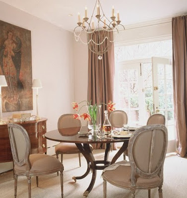
  I am sure you recognize this room from Better Homes and Gardens, which has been all over the blogs. Here you can see an example of the 12 arm style.
 Niermann Weeks writes about the Italian Chandelier on their website.


 It is a large home but
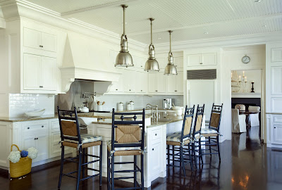


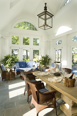
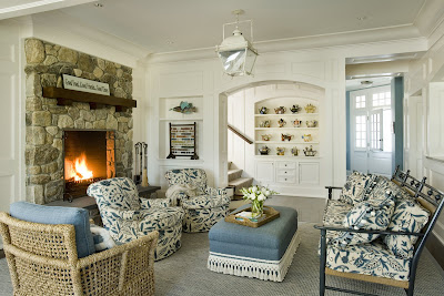 Though the house is large the room scale is perfect. Here the sitting room feels cozy with the addition of a spectacular stone fireplace. Again notice the details: Built ins, wainscoting even a small niche for an antiques. Also notice how the designer adds textural interest in this room with the wicker chairs, bench, heavy fringed ottoman and carpet. Another lantern hangs above.


 And now from the outside. I love the eyebrow window in the


